Oriel
Quiet luxury skincare identity
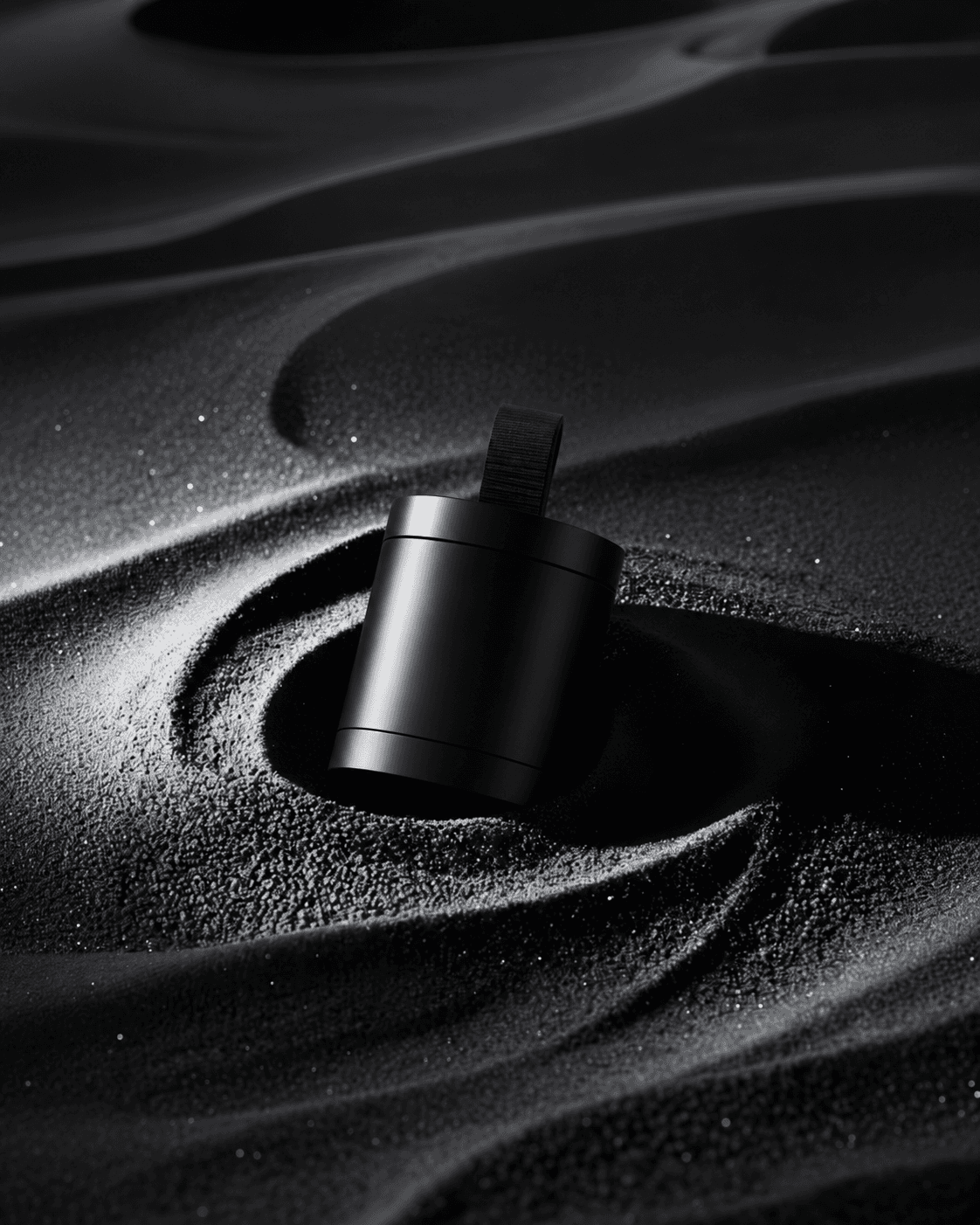
A calm, minimal identity for a skincare line. Soft type, a muted palette and a mark that works from the jar lid to the storefront.
Demo Client
Logo, Identity, Packaging



The Challenge
Skincare shelves are loud. Oriel wanted to stand out by doing less, and to look premium without the usual gold foil and heavy serifs.
The Approach
We stripped the identity back to a thin, airy wordmark, a sand-and-stone palette and lots of white space. The packaging uses one weight of type and a single soft accent, so the product does the talking.
The Outcome
A calm, consistent system that works the same on a jar lid, an Instagram post and a shop window: quiet, but impossible to mistake.
PedrooStudioz@2026
Designed By Raghav